start a project

close
CONNECT
opereyrajp@gmail.com
c.omar.pereyra@gmail.com
c.omar.pereyra@gmail.com
social
Lead Product Designer (UX/UI)
Techreo

Starting with Alignment, Not Assumptions
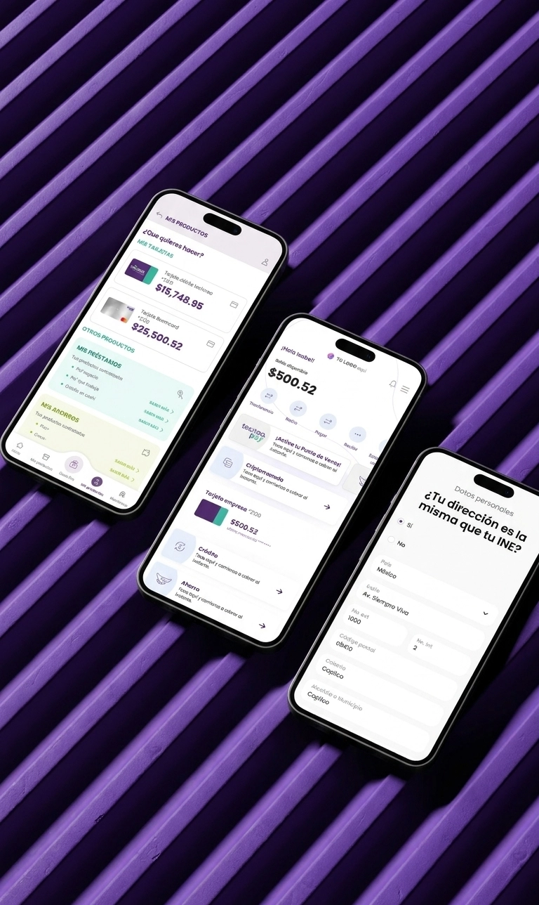
Techreo is a Mexican fintech that provides white-label mobile banking solutions to emerging financial institutions across Latin America. Their flagship mobile app allows users to manage their money, apply for loans, access credit cards, and create shared accounts.Techreo’s value lies in serving companies that want to compete with platforms like NU or Mercado Pago but lack the internal tech and design capabilities to build scalable digital products. These companies such as CAME (Mexico), IDEPRO (Bolivia), and Pagaqui (Mexico) require customizable, user-friendly, and robust financial apps to serve their own end users.When I joined Techreo, there was no UX team in place.
I joined as the first UX hire to lead the complete redesign of the mobile app and build the UX team from scratch. I implemented a scalable design process focused on user needs, adaptable to the different end-user profiles of each client (e.g., CAME, Pagaqui, IDEPRO), since every company purchasing the app had a distinct customer base
Company: Techreo
Role: Lead Product & UX/UI Designer
Duration: Aug 2022 – Mar 2024
Platform: Mobile App (Android & iOS)
Business Type: B2B2C Fintech
.webp)
My initial responsibility was to prepare the app’s foundation to evolve into a scalable white-label product that could serve multiple financial institutions with very different user needs.
When I joined, the app was designed as a single solution for one client — no scalability, no UX team, no design process. Product decisions were made entirely by PMs and developers. As new partnerships came in, the cracks became impossible to ignore: the experience was fragile, inconsistent, and built on assumptions no one had ever validated.
No UX foundation or design system
The product had no consistent design patterns or scalable components. Every new feature required reinventing flows, causing inefficiencies and design debt.
Multiple user bases, one shared product
While initially designed for one institution, the vision was to expand the app to serve various fintech clients from urban professionals to underserved rural communities all within a single flexible framework.
Usability issues undermining business growth
Early client feedback (like from CAME) revealed user frustration during critical tasks like onboarding or applying for financial products. These problems threatened the success of future partnerships.
Lack of structured user research
Decisions were based on assumptions or internal opinions. There was no structured research process, user journey documentation, or usability testing in place.
Starting with Alignment, Not Assumptions
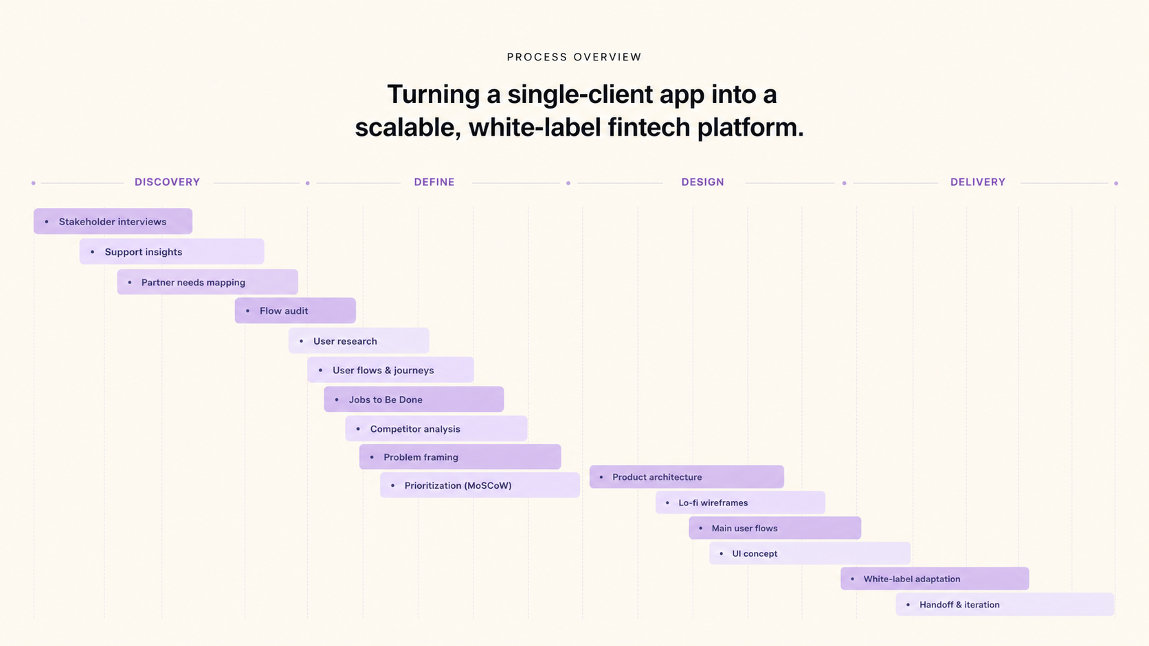
Before touching Figma, I ran a discovery sprint with product owners, legal, and customer support leads across Techreo and its partner institutions. The goal wasn't to validate assumptions — it was to surface which ones were wrong.
Two things became clear immediately. First, the team had been building features based on what they thought users needed, with no structured research to back it up. Second, each partner institution had fundamentally different users — different literacy levels, different trust barriers, different mental models around money. A single rigid UX wouldn't work for any of them.
These sessions shaped every research and design decision that followed. Instead of designing for a generic user, we designed for a system that could adapt to each context without breaking.
Customer Journey Hypothesis
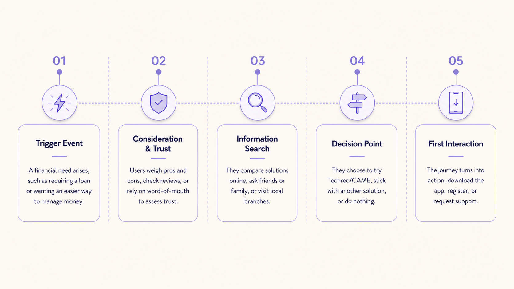
Rather than limiting our analysis to the in-app experience, I started by mapping the decision-making journey users take before ever downloading Techreo/CAME. The goal was to understand how and why users decide to adopt (or avoid) a digital financial app in the first place.
Mapping Decision Patterns
I segmented potential users into distinct groups, each with different motivations, barriers, and digital behaviors. For each, I created a hypothesis journey mapping their thought process from initial need to app adoption:
Key steps in the decision journey:
Proto-Personas & Interview Planning
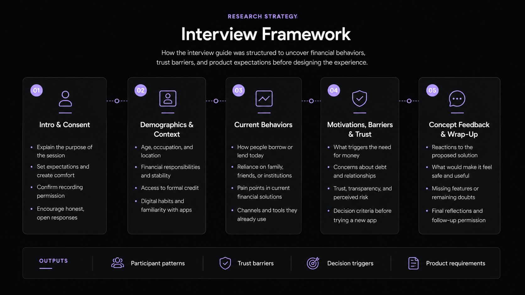
Using these hypothesis journeys and personas, I designed a targeted interview strategy. My goal was to validate (or challenge) our assumptions and uncover pain points that matter most.
With these proto-personas and journey maps, I built a structured interview guide (shared with the team) to ensure our research was repeatable and scalable as we onboarded new clients and user groups.
Insights that shaped the redesign
From stakeholder alignment and early user interviews, I synthesized recurring patterns around onboarding friction, trust, financial clarity, and the challenge of serving very different user profiles within one shared product. The research showed that the main challenge was not only improving individual flows, but designing a financial experience that felt safer, easier to understand, and flexible enough to adapt across partner institutions.
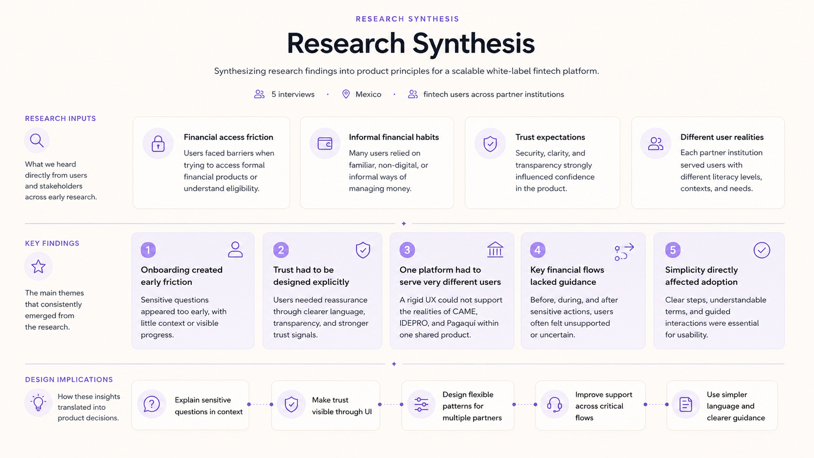
Key insights that shaped the redesign
After synthesizing stakeholder input, partner feedback, and early user research, I translated the findings into four product-level insights. These insights helped guide the redesign beyond visual consistency, focusing on trust, clarity, scalability, and support across critical financial journeys.
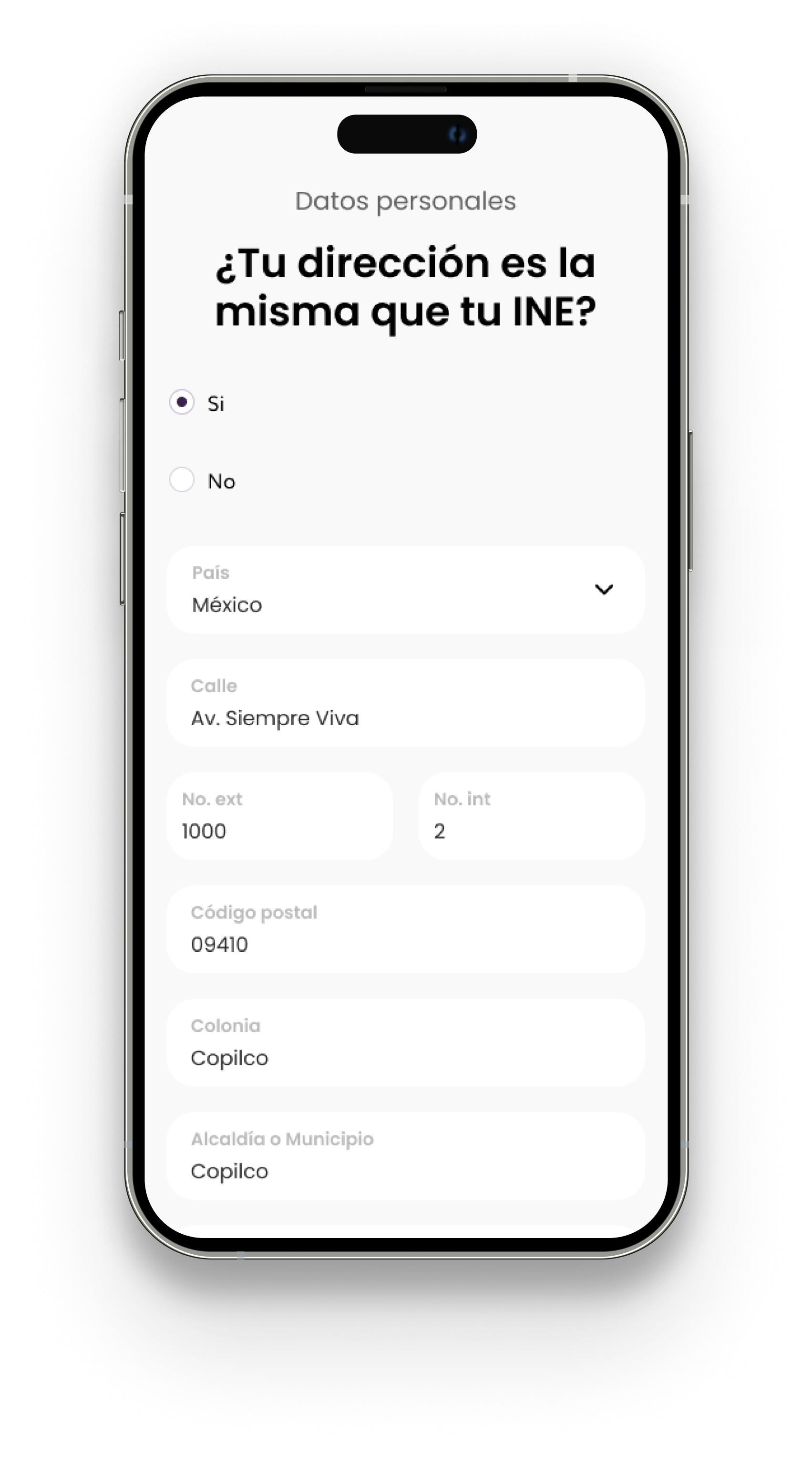
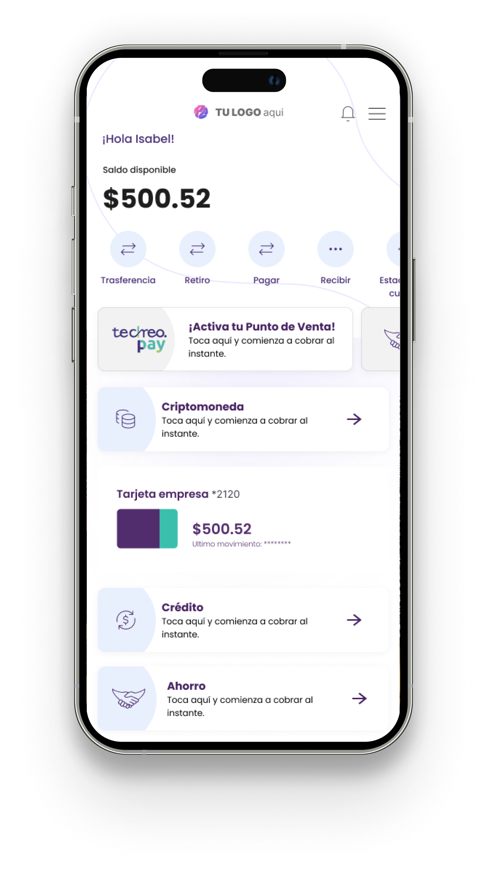
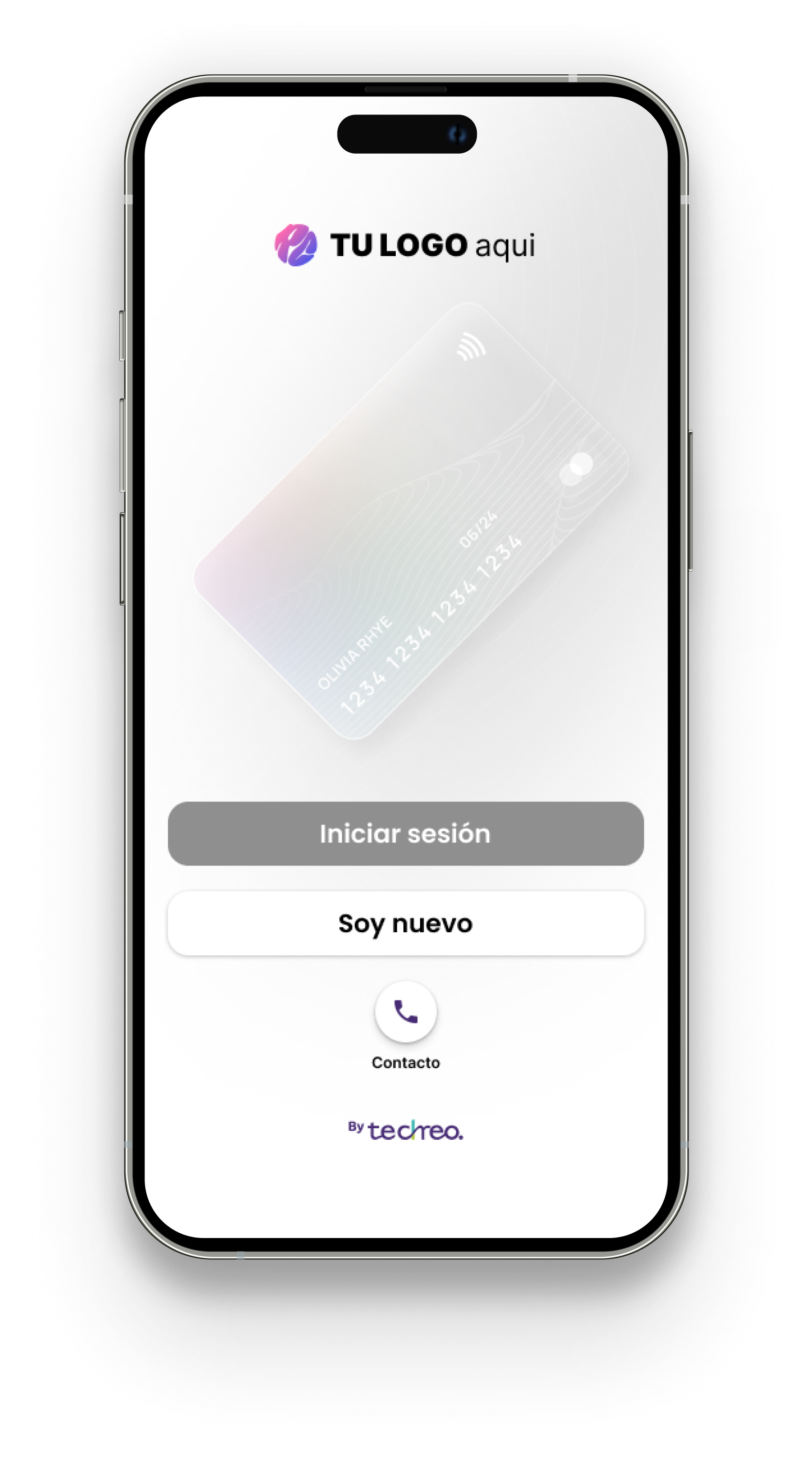
These insights became practical design principles for the redesign: explain sensitive moments, make trust visible, support different user realities, and guide users before, during, and after financial actions.
Customer journey map
To better understand adoption beyond the interface itself, I mapped the full journey users go through before and during first use. This helped uncover moments of hesitation, trust-building needs, and decision patterns that later informed the redesign.
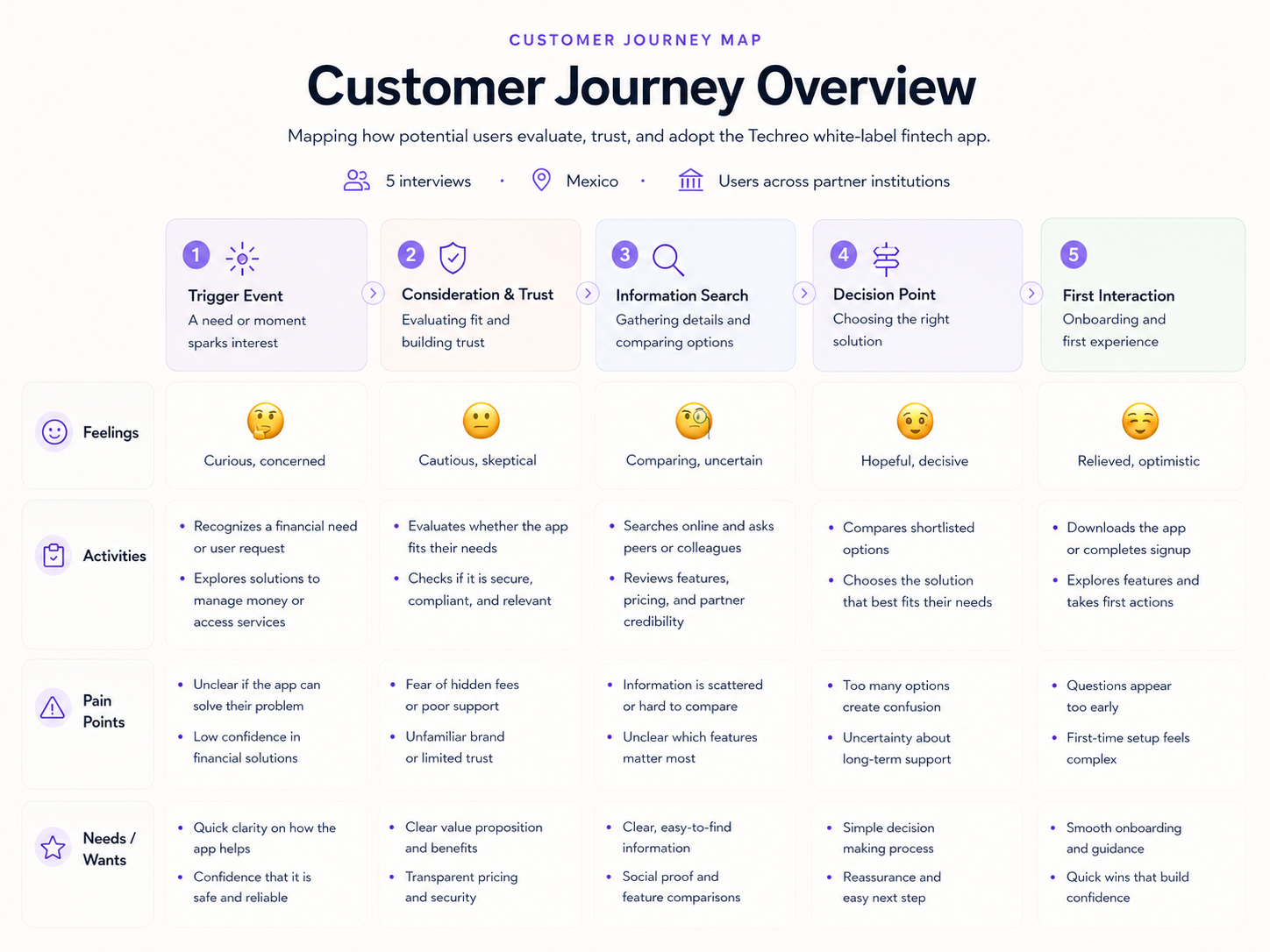
Journey map showing how users move from an initial financial need to first meaningful product interaction.
Turning research insights into three product principles: flexibility, simplicity, and coherence.
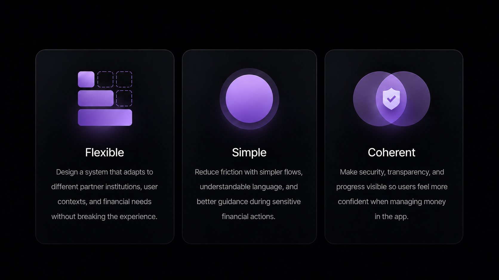
From these insights, three product principles guided every decision that followed: flexibility to adapt across partner institutions, simplicity to reduce cognitive load at every step, and coherence to keep the experience consistent even as brand and content changed underneath it.
Finding the gap between infrastructure and user experience
To understand where Techreo could differentiate, I analyzed fintech infrastructure platforms and consumer-facing financial apps. The goal was not to compare identical competitors, but to identify the gap between scalable financial infrastructure and a ready-to-use mobile experience that institutions could adapt to their own users.
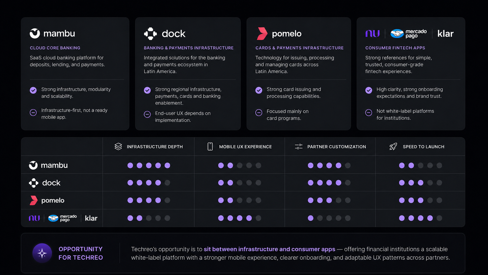
Turning insights into a focused roadmap
After identifying the main friction points across onboarding, trust, scalability, and support, I mapped potential improvements by impact and effort. This helped separate quick UX wins from larger product initiatives, so the redesign could move forward without trying to solve everything at once.
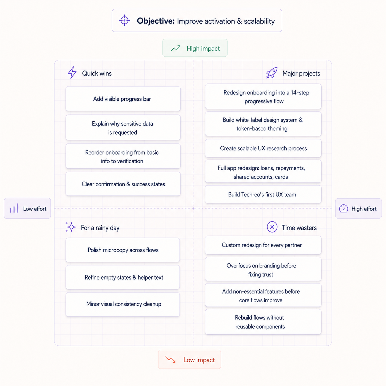
The matrix helped align priorities around one objective: improving activation, trust, and scalability without adding unnecessary complexity.
Structuring the product before designing screens
After defining the main product priorities, I mapped the first complete user flow of the app to understand how onboarding, account creation, verification, product discovery, and core financial actions connected as one experience.
This helped identify where the app needed clearer entry points, better decision logic, and reusable flow patterns before moving into detailed interface design.
Early app-level user flow used to align onboarding, account setup, product access, and core financial journeys across the white-label platform.
Sketching the Core Experience
Once the app flow was defined, I translated the main journeys into low-fidelity sketches to explore layout, hierarchy, and interaction patterns before moving into high-fidelity UI.These early explorations helped validate how core elements such as the home dashboard, quick actions, product cards, empty states, and promotional modules could work together in a scalable mobile experience.
Early sketches exploring the home experience, quick actions, product visibility, and empty states for the first version of the mobile app.
From screens to product logic
I translated the low-fidelity sketches into an app-level wireflow to understand how onboarding, verification, dashboard access, financial products, support, and error states worked together as one experience.This helped define reusable flow patterns and clarify the logic behind primary, secondary, and conditional user paths.
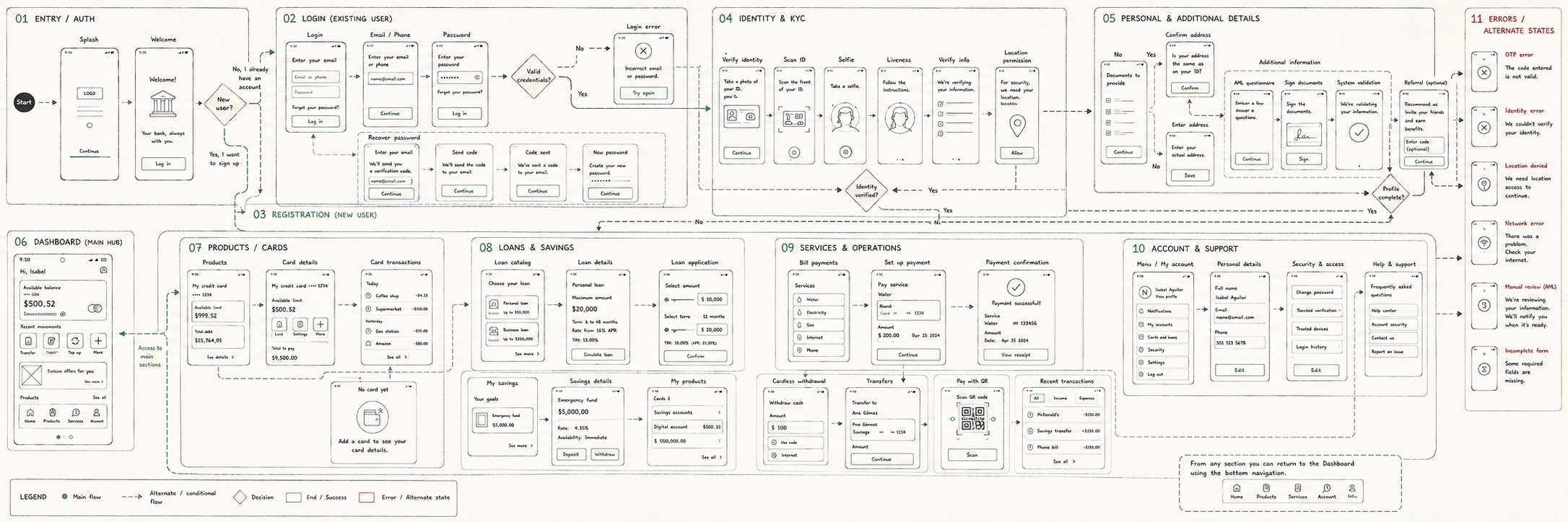
Early wireflow connecting core screens, product journeys, and alternate states across the first version of the app.
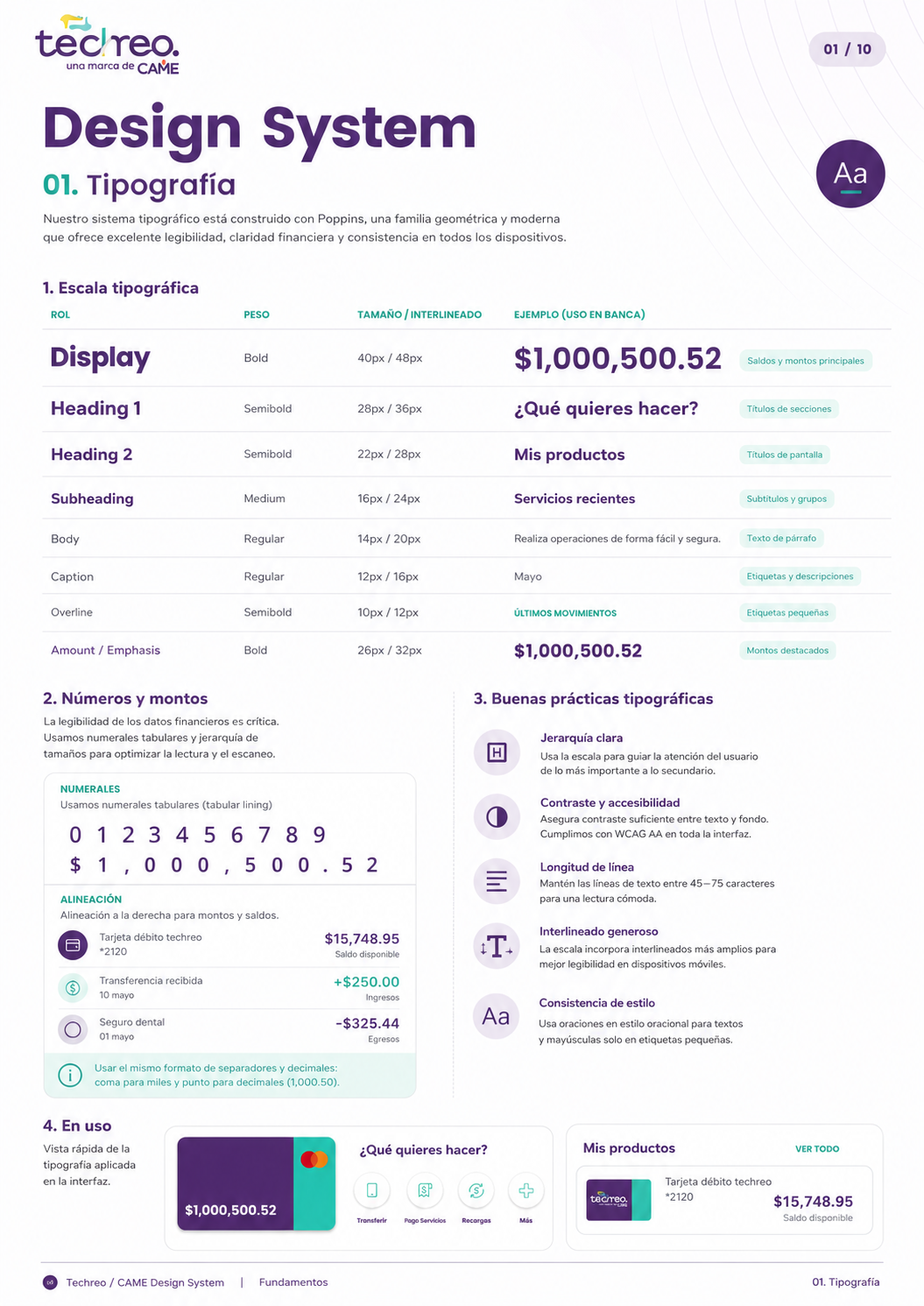
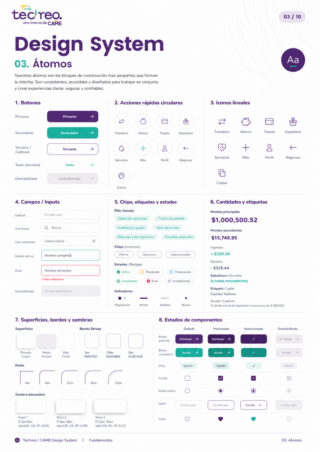
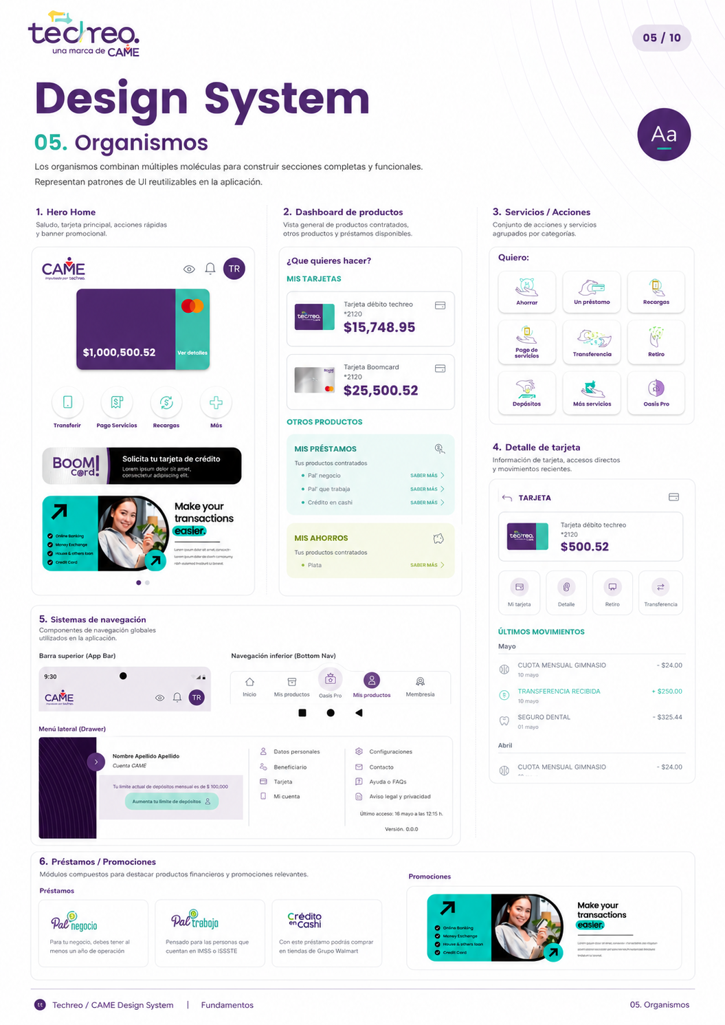
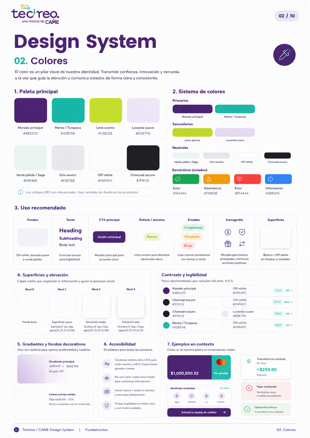
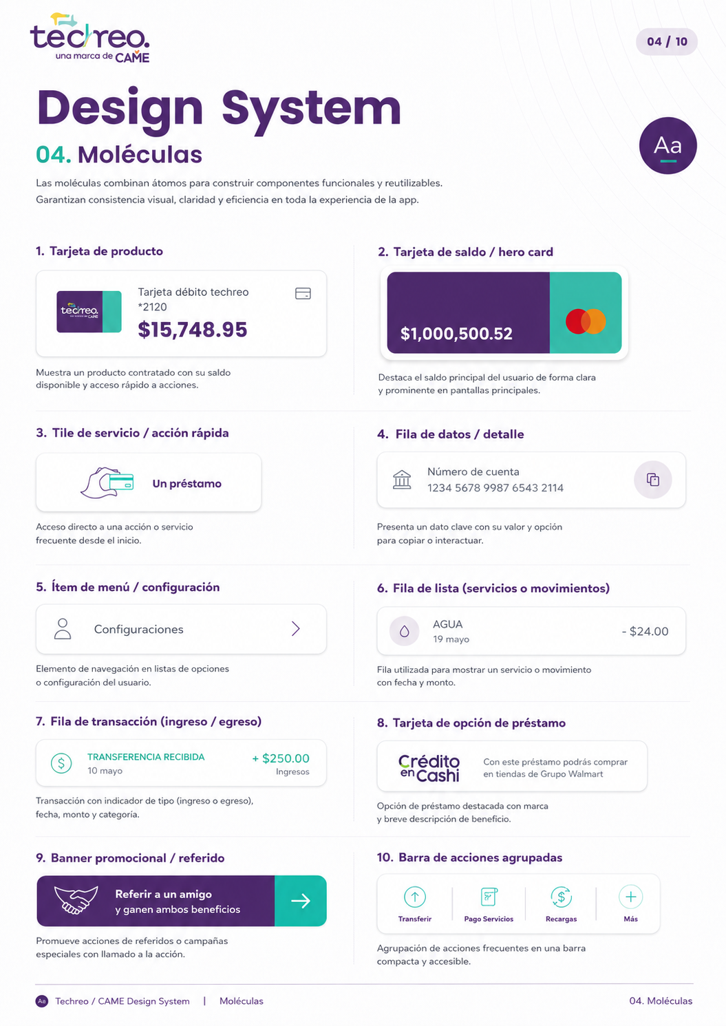
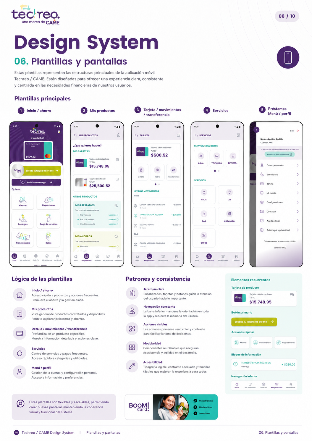
From interface redesign to product system
Because Techreo operated as a white-label platform, consistency alone was not enough. The app needed a flexible system that could support different partner brands, product configurations, user profiles, and financial flows without requiring a redesign from scratch every time.I defined reusable UI patterns, visual foundations, component states, and product modules to create a more scalable design workflow for both the internal team and future partner implementations.
Onboarding: From Friction to Clarity
Onboarding was where users made their first real judgment about the product — and most of them were leaving before finishing it. Completion time ranged from 13 to 25 minutes. Abandonment was high. The experience didn't feel like signing up for a financial app. It felt like filling out a government form.
The problem wasn't the number of screens — it was the cognitive load per screen. Personal data, identity verification, proof of address, and tax documentation were all crammed together with no explanation, no progress visibility, and no signal that the end was near. Users weren't confused by the questions. They were confused by the silence around them.
I had no access to the original design files and no baseline data. So instead of optimizing what existed, I started by questioning whether each requirement actually needed to be there at all.
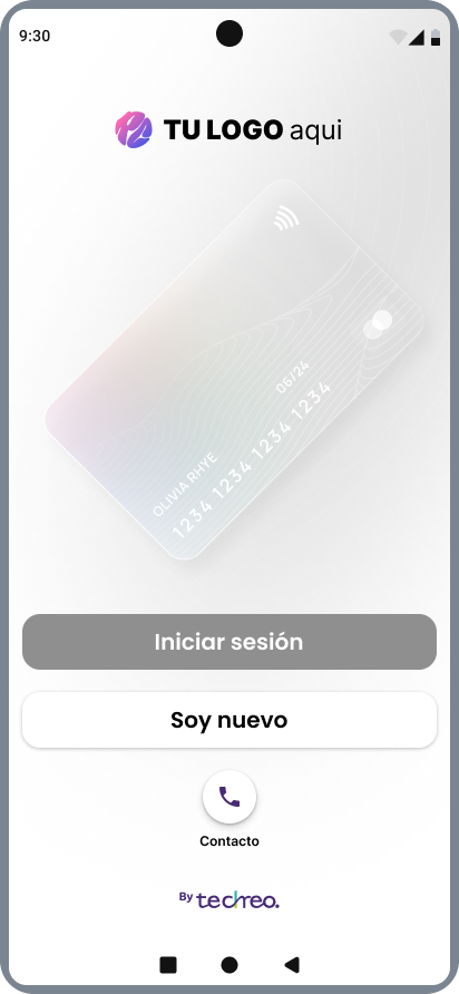 White-label entry point
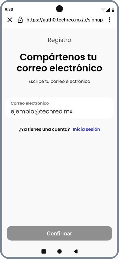 Step 1 — clear start
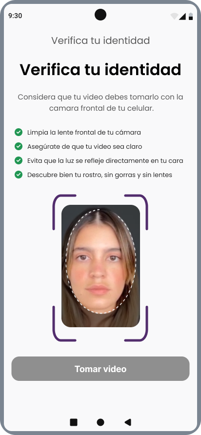 Identity verification
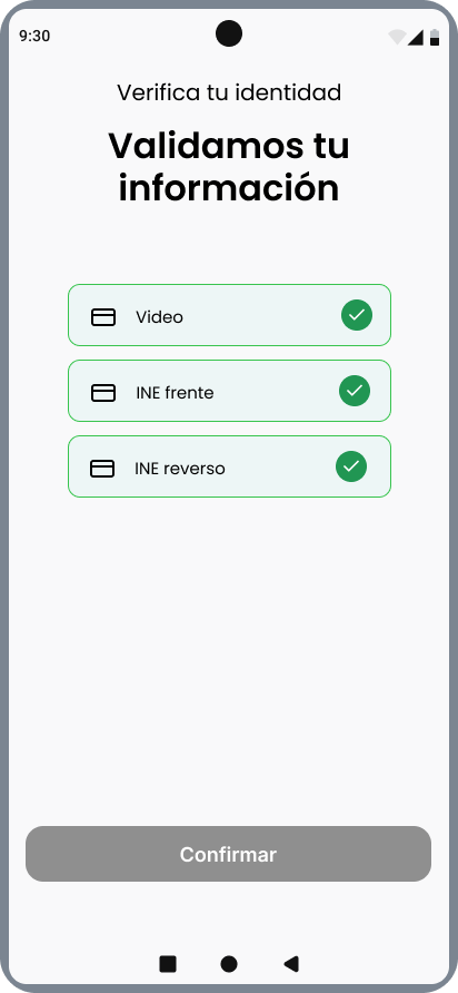 Clear confirmation state
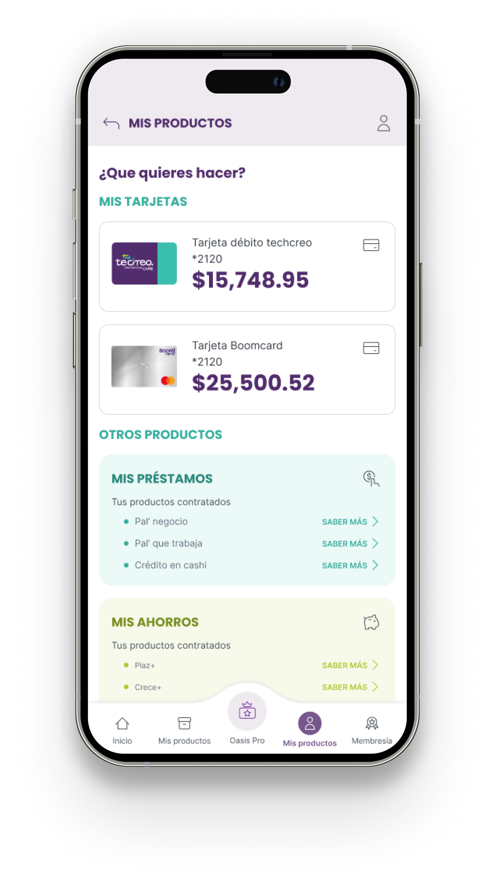
Shown in base white-label theme — each partner injects their own brand identity while the UX structure stays fixed across all institutions.
The Approach
Working with Product and Legal, I challenged every step in the flow. Some requirements turned out to be optional at registration they could be collected later without affecting compliance. Others were legally necessary but had never been explained to the user. We cut what we could and contextualized the rest.
The redesign redistributed the same requirements across a clearer 14-step progressive flow:
A visible progress bar at every step users always knew where they were and how much was left. Contextual explanations before each sensitive request building trust before asking for it, not after. Logical sequencing from low-stakes to high-stakes data basic info first, financial and identity verification last.
We tested with 10 users in a controlled environment before shipping. Business timelines meant we launched before completing all validation rounds but even this first iteration moved the number. Onboarding abandonment dropped 30%. Completion time fell to ~10 minutes. And the patterns we established here became the foundation for redesigning every other flow in the app.
.png)
Scaling into a Full App Redesign
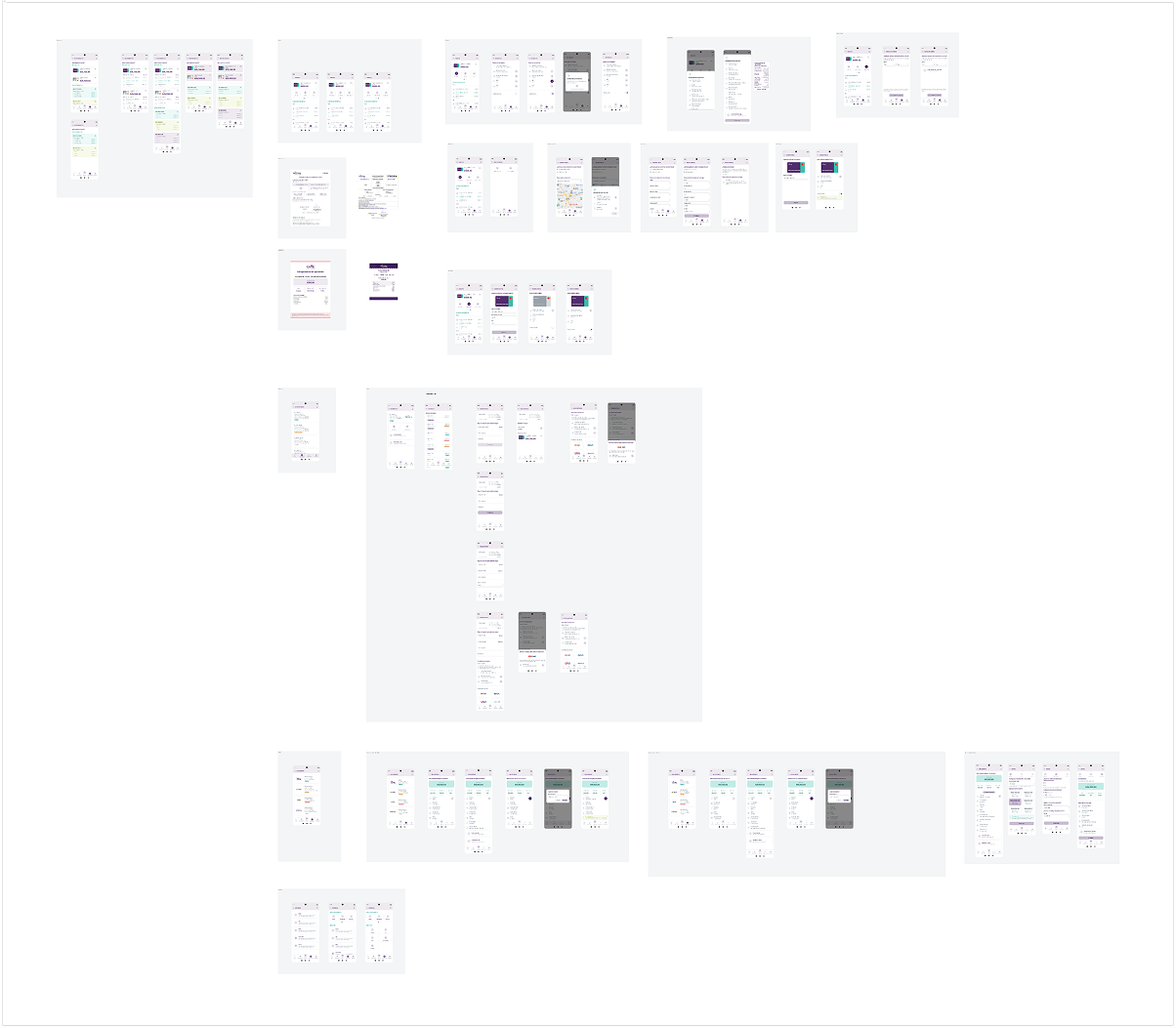
With onboarding validated, I extended the same principles — clarity, progressive disclosure, contextual guidance — across every flow in the app: loan applications, repayment tracking, shared accounts, and credit card management.
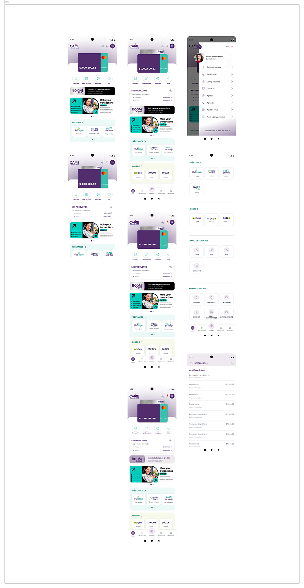
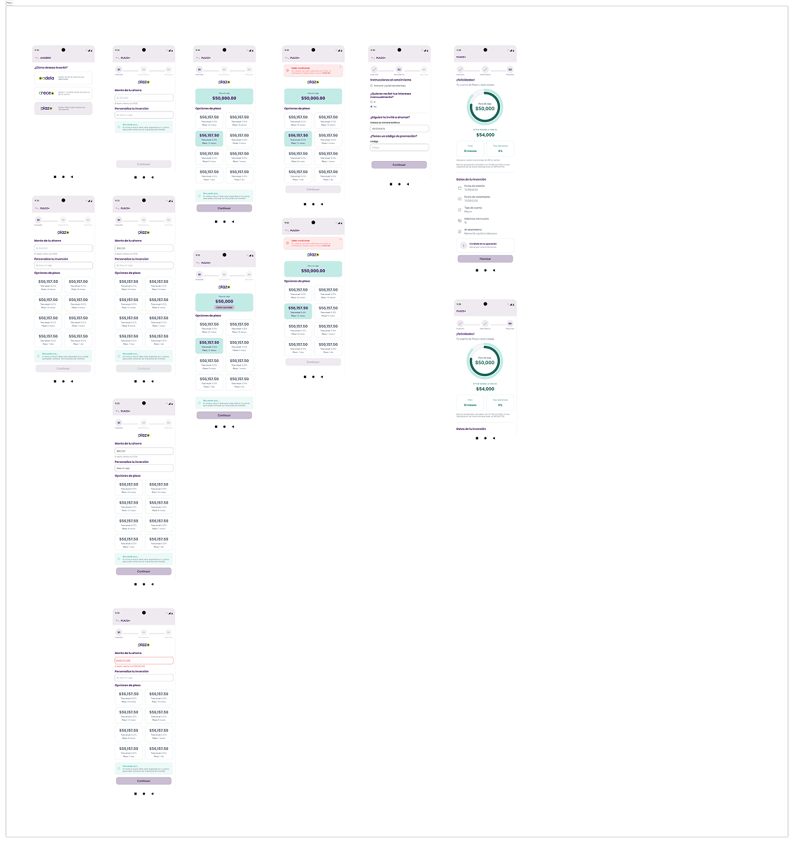
The core design challenge at this stage was tension between flexibility and consistency. A white-label product needs to feel like CAME to CAME's users, and like IDEPRO to IDEPRO's users — but the underlying UX logic has to stay solid across all of them.
My solution was a token-based theming layer built into the design system: each partner injects their brand colors, typography, and tone of voice, while the component architecture, spacing, interaction patterns, and information hierarchy stay fixed. The result is a product that feels native to each institution without requiring a full redesign for every new partner.

Results
The redesign touched every layer of the product — from the first screen a user sees to the system that lets three different institutions call it their own.
Fewer users dropped off after the redesign, directly improving CAME's ability to convert new users.
Down from 13–25 minutes. Same regulatory requirements, redistributed into a clearer progressive flow.
CAME, IDEPRO, and Pagaqui — each with distinct users and brand identity, all served by the same system.
Built Techreo's first UX team and research process from nothing. Became the standard for all future product work.
The biggest lesson from Techreo wasn't about UI patterns or design systems — it was about what happens when you design for people who have historically been failed by institutions. Every screen was a negotiation between what the business needed and what users were willing to give. Getting that balance right required more than good UX — it required understanding the emotional context behind every interaction.
Building the UX function from zero also forced me to think beyond deliverables: what processes, documentation, and standards would outlast my tenure? That question shaped how I approached every decision.